Building a UX Risk Scanner — From Market Gap to Live Product
How I designed and vibe-coded an AI-powered compliance & UX audit tool that scans any website in 20 seconds.
The Market Gap
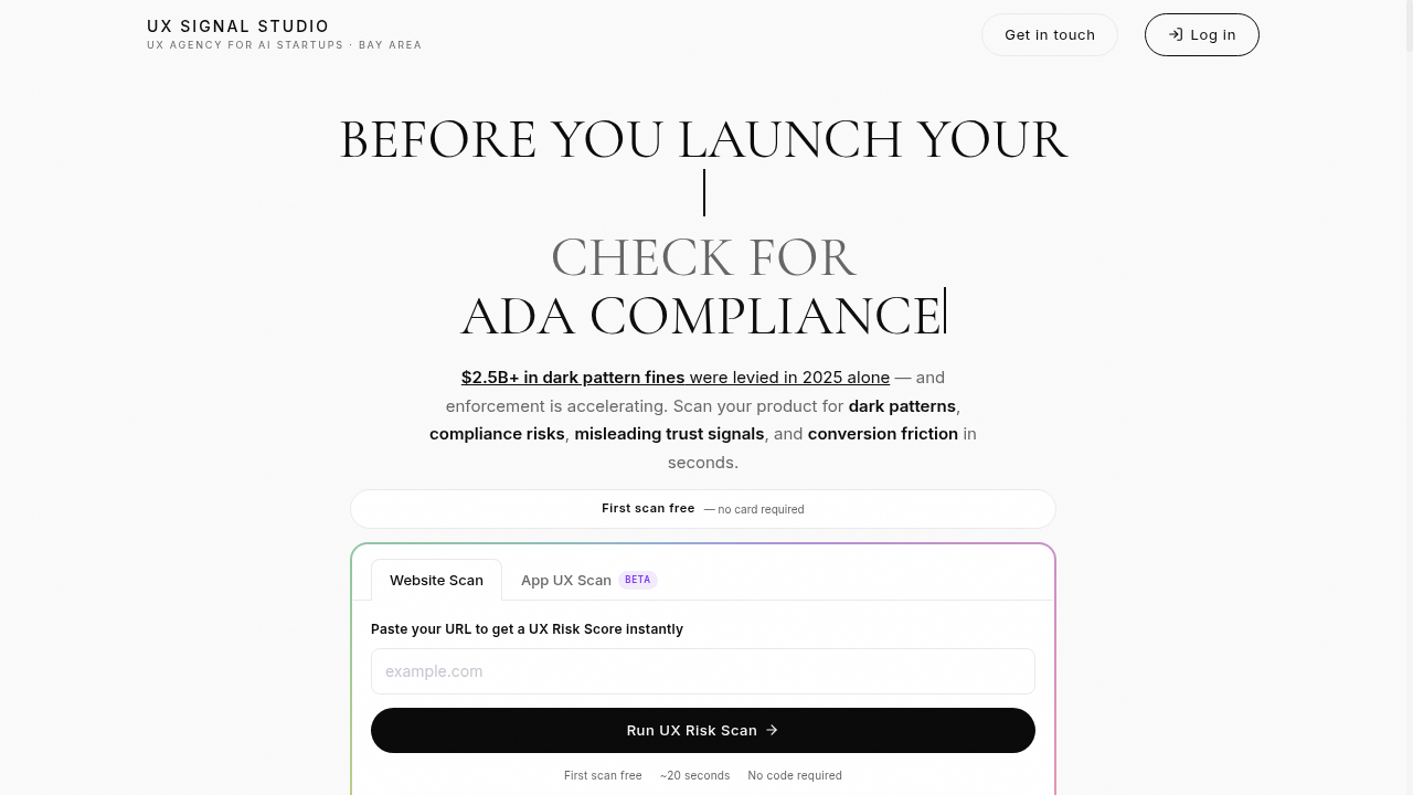
$2.5B+ in dark pattern fines were levied in 2025 alone — and enforcement is accelerating. AI tools help founders ship faster, but they also generate interfaces that quietly violate consumer protection guidelines.
Existing tools fell into two camps: expensive enterprise accessibility scanners that miss UX problems entirely, or manual UX audits that cost $5K–$15K and take weeks. Neither served the founder who needed to know "is my landing page going to get me in trouble?" before launch.
I saw a gap: a fast, AI-powered scan that checks for dark patterns, compliance risks, misleading trust signals, and conversion friction — all in under 20 seconds, with the first scan free.
Why This Matters
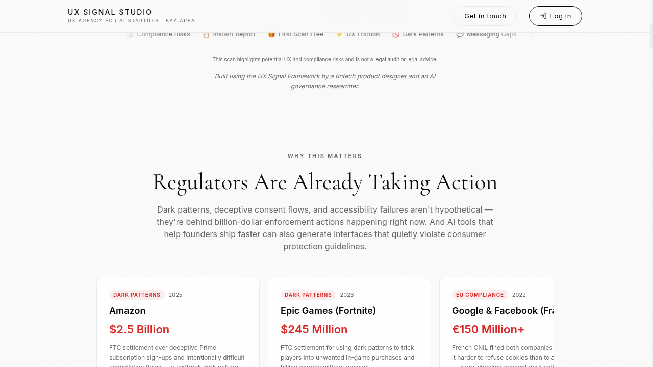
The landing page educates users on the regulatory landscape — real enforcement actions from Amazon ($2.5B), Epic Games ($245M), and Google/Facebook (€150M+) — before they ever run a scan. This isn't hypothetical risk.
The Product
The scanner takes a URL, captures desktop and mobile screenshots via a headless browser, then runs them through a multi-model AI pipeline that evaluates across five categories:
UX Friction
Drop-off points, unclear flows
Visual / Layout
Hierarchy, spacing, readability
Messaging & Copy
Clarity, trust, specificity
Dark Patterns
Manipulative design tricks
Legal / Compliance
GDPR, ADA, FTC risks
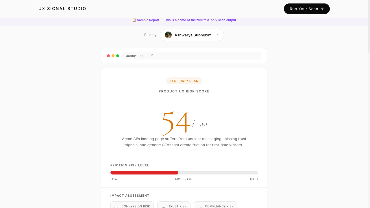
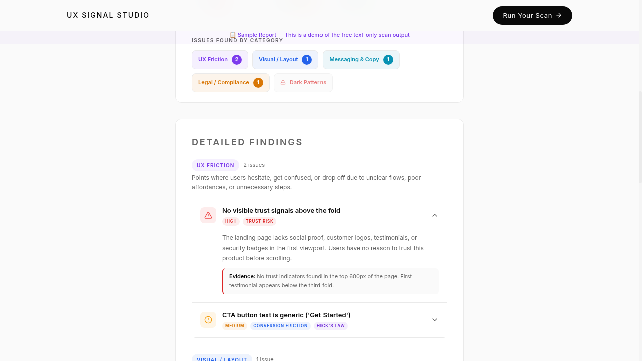
Each issue is tagged with severity (High / Medium / Low), mapped to a risk category (Conversion, Trust, Compliance), and accompanied by specific evidence pulled from the page — not generic advice.
Findings That Actually Help
Unlike generic audit checklists, each finding includes a specific description, evidence from the actual page, and actionable guidance. Issues are grouped by category with expandable detail panels.
How I Built It
The entire product was vibe-coded solo — no backend engineers, no separate design-to-dev handoff. Here's the stack and approach:
Problem Framing
Identified the gap between enterprise accessibility tools and manual UX audits. Defined the value prop: instant, AI-powered UX risk scanning for founders and product teams.
Architecture
Designed a serverless architecture using Supabase Edge Functions, headless browser capture via BrowserBase, and multi-model AI analysis with Gemini for visual and text-based evaluation.
Scan Pipeline
Built a pipeline that captures full-page desktop + mobile screenshots, extracts page HTML/text, then runs both through an AI prompt engineered to identify specific UX and compliance issues with evidence.
Results Engine
Designed the scoring system (0–100 UX Risk Score), category-based issue grouping, severity tagging, and impact assessment across Conversion, Trust, and Compliance risk dimensions.
Monetization
Implemented a freemium model: first scan free (no account required), then tiered pricing for Visual Scans (with screenshot evidence) and paid scan packs via Stripe checkout.
Growth Loops
Built scan caching for repeat visitors, rate limiting, waitlist capture for premium features, and a sample report system to demonstrate value before signup.
Technical Architecture
Frontend
React + TypeScript, Tailwind CSS, Framer Motion, Lovable
Backend
Supabase Edge Functions (Deno), PostgreSQL, Row-Level Security
AI Pipeline
Google Gemini (vision + text), structured JSON output, evidence extraction
Infrastructure
BrowserBase for headless capture, Supabase Storage for screenshots, Stripe for payments
By the Numbers
~20s
Scan Time
5
Risk Categories
0
Engineers
Key Design Decisions
Why free first scan with no account?
Reducing friction to zero for the first experience. Users see the value of the scan before any commitment. This mirrors the Credit Karma playbook — show the score, then upsell.
Why visual scans as the premium tier?
Text-only scans miss layout issues, visual hierarchy problems, and dark patterns that only appear in the rendered UI. Screenshot-based analysis is dramatically more accurate — and worth paying for.
Why evidence-based findings over generic checklists?
Every issue cites specific evidence from the scanned page. 'No trust signals above the fold — first testimonial appears below the third fold' is actionable. 'Add social proof' is not.
Why the regulatory education section?
Most founders don't know they're at risk. Leading with $2.5B in real fines creates urgency and positions the scan as risk mitigation, not just UX advice.
What I Learned
AI prompts are design decisions
The quality of the scan output is 90% prompt engineering. Structuring the AI to return evidence, not opinions, required dozens of iterations.
Edge functions are the new backend
The entire scan pipeline runs in a single serverless function — capture, analyze, score, store. No servers to manage, no DevOps.
Freemium needs a clear value cliff
The free text-only scan is useful, but the visual scan with screenshots is dramatically better. That gap is the monetization lever.
Regulation is a feature, not a threat
Building around compliance turned a UX tool into a risk mitigation product — a much easier sell to founders and legal teams.
Try it yourself
First scan is free — no account required.